
i. reverse storyboarding with rey


iv. thoughts on color palettes
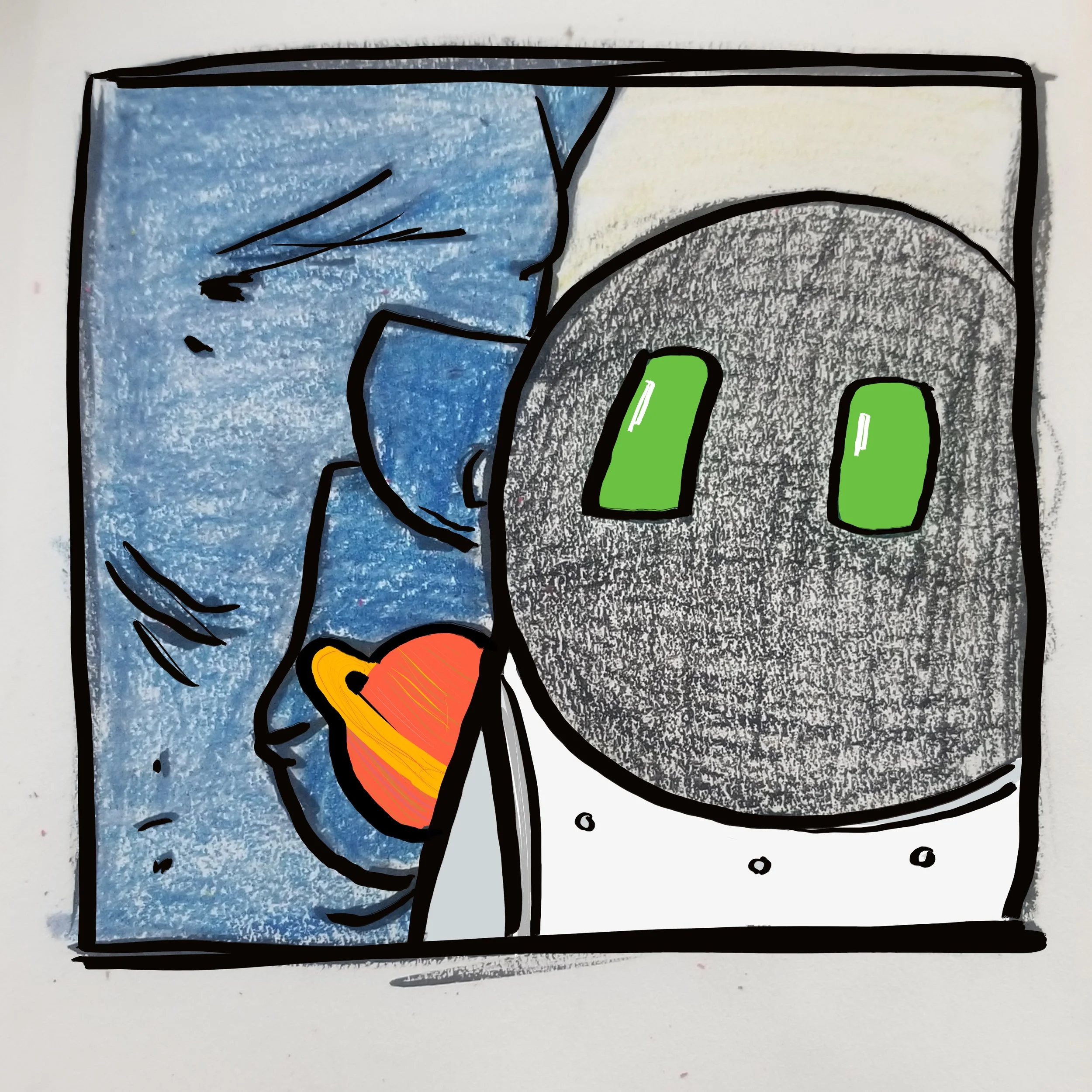
While investigating all the designs of my favorite star ships throughout the week, I came to the conclusion that MK's ship could be adequately described as a junker. It's an old ship, it's been through some tougher times, and now it's kept in shape exclusively by a 13 year old with limited funds. So it's not the shiny and chrome look of the USS Enterprise when it pulls out of the space dock for the first time, or the immaculate crispness of an Imperial Star Destroyer, but more like the Millennium Falcon and the Serenity. The Serenity especially has a warmer, lived-in feel that I like, with the look of struggling to keep it all together.
The color palettes I am leaning towards have more of the warmer tones, of soft light and worn metal. Browns and reds and yellows with blue accents, to contrast the coldness of the rest of space.
This is the color palette I pulled from my mood board: